A chart can clarify a system. It can also conceal the choices that shaped it. A new MoMA exhibition asks visitors to look at information design as both a practical tool and an exercise of power.
Full Disclosure: The Edge of Information Design, opening September 27, brings together contemporary projects that translate data into maps, networks, diagrams and animated narratives. The exhibition’s premise is urgent and simple: data does not become knowledge until somebody designs a way to see it.
Who draws the map?
The show ranges across digital and analog work, examining how designers expose hidden structures, preserve histories and make enormous systems legible. MoMA places particular emphasis on trust. Every visualization contains decisions about what to include, what to omit and which relationships deserve emphasis.
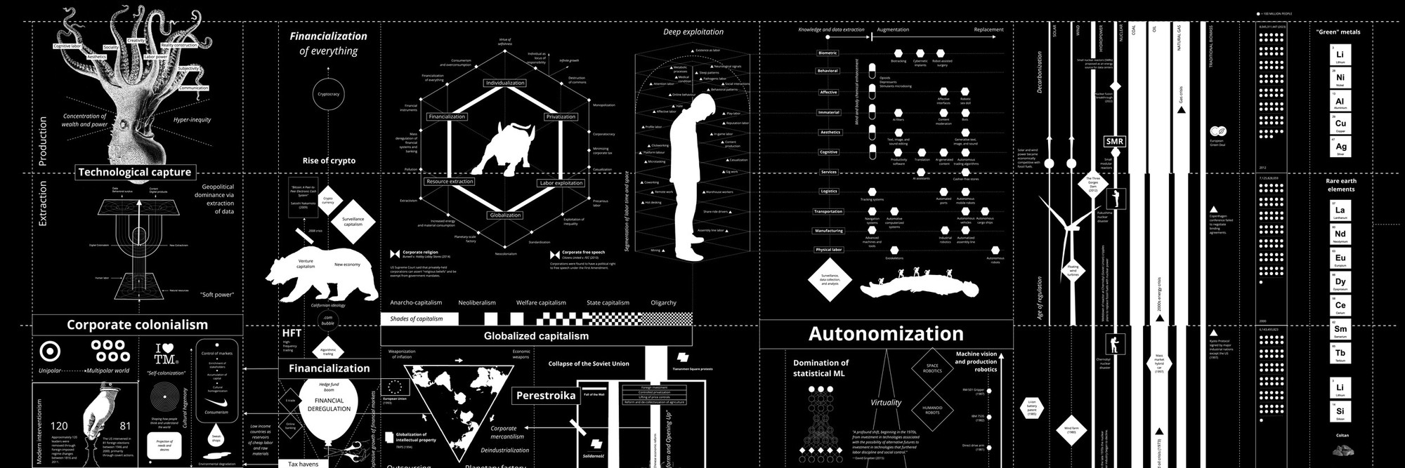
Among the exhibition’s anchors is Kate Crawford and Vladan Joler’s Calculating Empires, a sprawling visual anatomy of technology, labor, extraction and corporate power. Its density resists the frictionless simplicity associated with much contemporary data graphics. The work asks viewers to follow connections rather than accept a single clean conclusion.
The exhibition arrives as algorithms and artificial intelligence increasingly influence decisions that once appeared social, political or personal. MoMA’s framing does not treat visualization as decoration. It presents design as the point at which information acquires a voice.
Plan your visit
- Where: MoMA, 11 West 53rd Street, Floor 1 South
- Dates: September 27, 2026 through June 13, 2027
- Opening: Sunday, September 27
Source: The Museum of Modern Art.
Reading the picture
Information design often disappears when it works. A subway map, election graphic or weather chart can feel less like an authored object than a transparent window onto facts. Full Disclosure asks viewers to reverse that habit and notice the decisions embedded in the picture.
Every visualization begins with selection. A designer chooses a time scale, categories, colors, boundaries and relationships. Those decisions can make a pattern visible, but they can also determine which pattern the audience notices first. The same body of information can produce very different stories depending on what is counted and how it is arranged.
That is particularly important in an era of dashboards. Institutions increasingly present complicated realities through interfaces that promise immediate comprehension. The visual polish can create an impression of neutrality. Yet a clean chart may contain assumptions about what matters just as surely as a paragraph contains an argument.
Calculating Empires pushes in the opposite direction. Its density makes comprehension laborious. Instead of reducing technological history to a neat progression, Crawford and Joler assemble networks of extraction, labor, communication, classification and control. The viewer has to navigate rather than merely receive.
Why this belongs at MoMA
A museum of modern art and design is a useful place for this argument because charts and diagrams occupy an ambiguous cultural position. They are functional objects, but they also rely on typography, composition, hierarchy and visual metaphor. They persuade through form even when their stated purpose is simply to explain.
For visitors, the exhibition offers a practical exercise. Before accepting what a visualization seems to say, ask a few basic questions: Who assembled the information? What is absent? What is emphasized? What period does the image cover? What changes when a relationship is shown spatially rather than described in prose?
Those questions matter beyond museums. Artificial intelligence systems, financial platforms, public agencies and news organizations all depend on visual interfaces to make complex systems manageable. The danger is not that visualization inevitably distorts. It is that good design can make interpretation feel like fact.
The exhibition’s strongest proposition is therefore not anti-data. It is pro-attention. Information needs form before humans can use it. Once it has form, it deserves to be read with the same care we bring to any other authored object.
Allow time to stand close to the complicated works. The exhibition is likely to reward a slower pace than its subject suggests. Information graphics train us to scan, extract a conclusion and move on. Here, the more productive behavior may be the opposite: follow a line, notice a category, lose the thread and begin again.
That friction is useful. The contemporary information environment is optimized to remove it, offering summaries, scores and automated answers. Full Disclosure makes a case for looking at the apparatus that produces clarity. Sometimes understanding begins when an image stops seeming obvious.

